Post History
My first response is that a really like this picture. However, there are some details I'd probably change, or at least experiment with. Here is a scaled down original for comparison with subsequent...
#1: Initial revision
My first response is that a really like this picture. However, there are some details I'd probably change, or at least experiment with. Here is a scaled down original for comparison with subsequent versions: 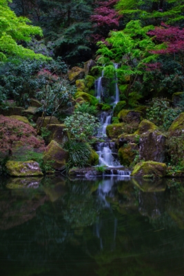 The picture looks a little dingy, at least on my monitor. The first step is to at least use the full available dynamic range. here is simply making the blacks black and the whites white: 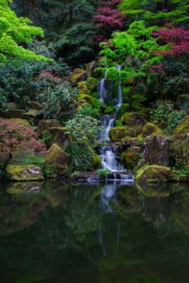 I think the large part of the picture devoted to the pool doesn't add much. I do like the swirling leaves, but I didn't even notice them until you pointed them out. The main feature is the waterfall, surrounded by all the lush vegetation. There are different possible treatments of the waterfall. Here is the brute force version: 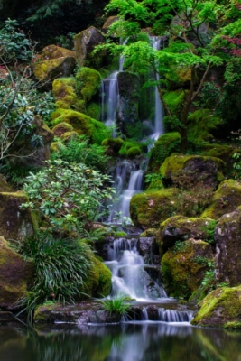 I think that looks to sterile or clinical. Here is another option: 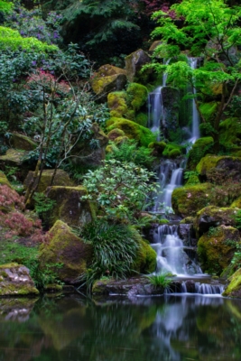 This sets the trees at left off against the waterfall at right. Here is trying to make the picture a little brighter by allowing a little bit of clipping in the white highlights of the waterfall: 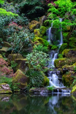 This resulted from making the bright highlights 1.15 (which causes clipping) instead of 1.0 before. There are lots of possibilities. You have a really nice picture to work from.


